How To Center A Div Css
Background of how to center a div css
Centering a <div> element in CSS is a fundamental skill for web developers, crucial for achieving aesthetically pleasing layouts. Whether you’re designing a simple webpage or a complex web application, mastering the art of centering elements using CSS is essential.
Traditionally, centering content within a webpage was achieved using various techniques, such as using tables for layout or relying on JavaScript. However, with the evolution of web standards and the adoption of modern CSS, centering content has become more straightforward and efficient.
CSS offers several methods for centering a <div> element, each with its advantages and use cases. These methods include using margin auto, Flexbox, and CSS Grid. Understanding when and how to apply each technique is key to creating responsive and visually appealing designs across different screen sizes and devices.
In this article, we’ll explore these methods in detail, providing clear explanations and practical examples to help you grasp the concepts effectively. Whether you’re a beginner learning the basics of web development or an experienced developer looking to refine your skills, understanding how to center a <div> element using CSS is a valuable asset in your toolkit.
Techniques of how to center a div css
In CSS, centering a <div> element can be achieved using various techniques. Let’s explore some of the most common methods:
1. Using Flexbox:
Flexbox provides a straightforward way to center elements both horizontally and vertically. Here’s how you can use Flexbox to center a <div>:
<!DOCTYPE html>
<html lang="en">
<head>
<meta charset="UTF-8">
<meta name="viewport" content="width=device-width, initial-scale=1.0">
<title>Centering a Div with Flexbox</title>
<style>
  .container {
    display: flex;
    justify-content: center; /* Horizontally center */
    align-items: center; /* Vertically center */
    height: 100vh; /* Full viewport height */
  }
  .content {
    width: 200px;
    height: 200px;
    background-color: #f0f0f0;
  }
</style>
</head>
<body>
<div class="container">
  <div class="content">
    <!-- Your content here -->
  </div>
</div>
</body>
</html>
A rendering of executing the code:

2. Using Grid:
Grid layout also offers a simple solution for centering elements. Here’s how you can use CSS Grid:
<!DOCTYPE html>
<html lang="en">
<head>
<meta charset="UTF-8">
<meta name="viewport" content="width=device-width, initial-scale=1.0">
<title>Centering a Div with CSS Grid</title>
<style>
  .container {
    display: grid;
    place-items: center; /* Center both horizontally and vertically */
    height: 100vh; /* Full viewport height */
  }
  .content {
    width: 200px;
    height: 200px;
    background-color: #f0f0f0;
  }
</style>
</head>
<body>
<div class="container">
  <div class="content">
    <!-- Your content here -->
  </div>
</div>
</body>
</html>
A rendering of executing the code:

3. Using Absolute Positioning:
Another approach is to use absolute positioning along with the top, left, bottom, and right properties:
<!DOCTYPE html>
<html lang="en">
<head>
<meta charset="UTF-8">
<meta name="viewport" content="width=device-width, initial-scale=1.0">
<title>Centering a Div with Absolute Positioning</title>
<style>
  .container {
    position: relative;
    height: 100vh; /* Full viewport height */
  }
  .content {
    position: absolute;
    top: 50%;
    left: 50%;
    transform: translate(-50%, -50%); /* Center the element */
    width: 200px;
    height: 200px;
    background-color: #f0f0f0;
  }
</style>
</head>
<body>
<div class="container">
  <div class="content">
    <!-- Your content here -->
  </div>
</div>
</body>
</html>
A rendering of executing the code:

These techniques offer flexible and efficient ways to center a <div> element using CSS. Choose the method that best fits your layout requirements and browser support needs.
Common Problem and Solutions of How to Center a Div CSS
One of the most common challenges developers face is centering a <div> element horizontally and vertically within its parent container. This task might seem simple at first glance, but achieving consistent and reliable centering across different layouts and screen sizes can be tricky. Let’s explore some common methods and solutions to this problem.
Method 1: Using Flexbox
Flexbox is a powerful layout model in CSS that provides a straightforward way to center elements both horizontally and vertically. By applying the appropriate flexbox properties to the parent container, we can achieve perfect centering with minimal code.
<!DOCTYPE html>
<html lang="en">
<head>
<meta charset="UTF-8">
<meta name="viewport" content="width=device-width, initial-scale=1.0">
<title>Centering a Div with Flexbox</title>
<style>
  .container {
    display: flex;
    justify-content: center; /* Horizontally center */
    align-items: center; /* Vertically center */
    height: 100vh; /* Full viewport height */
  }

  .centered-div {
    width: 200px;
    height: 200px;
    background-color: #f0f0f0;
    text-align: center;
    line-height: 200px;
  }
</style>
</head>
<body>

<div class="container">
  <div class="centered-div">
    Centered Div
  </div>
</div>

</body>
</html>
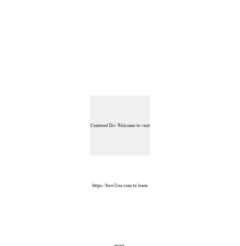
A rendering of executing the code:

In this example, the .container class uses display: flex to establish a flex container. By setting justify-content: center and align-items: center, we ensure that its child .centered-div is centered both horizontally and vertically within it.
Method 2: Using Absolute Positioning and Transform
Another approach to centering a <div> element is by using absolute positioning combined with the transform property. This method involves positioning the <div> at 50% from the top and left edges of its parent container and then using the translate transform to adjust it back by half of its own width and height, effectively centering it.
<!DOCTYPE html>
<html lang="en">
<head>
<meta charset="UTF-8">
<meta name="viewport" content="width=device-width, initial-scale=1.0">
<title>Centering a Div with Absolute Positioning and Transform</title>
<style>
  .container {
    position: relative;
    width: 100%;
    height: 100vh; /* Full viewport height */
    background-color: #f4f4f4;
  }

  .centered-div {
    position: absolute;
    top: 50%;
    left: 50%;
    transform: translate(-50%, -50%);
    width: 200px;
    height: 200px;
    background-color: #f0f0f0;
    text-align: center;
    line-height: 200px;
  }
</style>
</head>
<body>

<div class="container">
  <div class="centered-div">
    Centered Div
  </div>
</div>

</body>
</html>
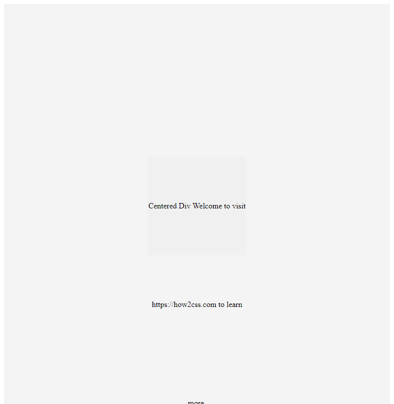
A rendering of executing the code:

In this example, the .container class serves as the parent container, and the .centered-div class is absolutely positioned within it. The top: 50% and left: 50% properties move the <div> to the center of its container, and transform: translate(-50%, -50%) offsets it back by half of its own width and height, achieving perfect centering.
These two methods offer reliable solutions for centering <div> elements using CSS. Depending on your project requirements and browser support considerations, you can choose the approach that best fits your needs. Experiment with these techniques and explore further customization to achieve the desired layout for your web applications.
Best Practices of How to Center a Div CSS
Centering a div using CSS may seem straightforward, but there are several best practices to consider for achieving consistent and responsive results across different browsers and devices. In this section, we’ll explore some of these best practices and provide practical code examples to illustrate each concept.
1. Using Flexbox for Centering
Flexbox is a powerful layout model in CSS that simplifies the process of creating flexible and responsive layouts. One of its key features is the ability to easily center elements both vertically and horizontally. Let’s look at an example:
<!DOCTYPE html>
<html lang="en">
<head>
  <meta charset="UTF-8">
  <meta name="viewport" content="width=device-width, initial-scale=1.0">
  <title>Centering a Div with Flexbox</title>
  <style>
    .container {
      display: flex;
      justify-content: center;
      align-items: center;
      height: 100vh; /* Full viewport height */
    }
    .content {
      width: 200px;
      height: 200px;
      background-color: lightblue;
    }
  </style>
</head>
<body>
  <div class="container">
    <div class="content">
      <!-- Your content here -->
    </div>
  </div>
</body>
</html>
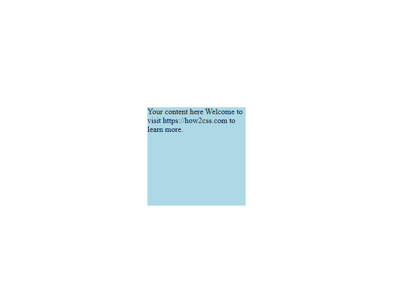
A rendering of executing the code:

In this example, we use the display: flex property on the container to establish a flex container. We then use justify-content: center and align-items: center to center the content horizontally and vertically within the container. The .content div represents the content you want to center.
2. Using Grid for Centering
CSS Grid Layout is another powerful tool for creating complex layouts, including centering elements. While Flexbox is more suitable for one-dimensional layouts, Grid excels at creating two-dimensional layouts. Here’s how you can center a div using Grid:
<!DOCTYPE html>
<html lang="en">
<head>
  <meta charset="UTF-8">
  <meta name="viewport" content="width=device-width, initial-scale=1.0">
  <title>Centering a Div with CSS Grid</title>
  <style>
    .container {
      display: grid;
      place-items: center;
      height: 100vh; /* Full viewport height */
    }
    .content {
      width: 200px;
      height: 200px;
      background-color: lightblue;
    }
  </style>
</head>
<body>
  <div class="container">
    <div class="content">
      <!-- Your content here -->
    </div>
  </div>
</body>
</html>
A rendering of executing the code:

In this example, we use display: grid to create a grid container. Then, place-items: center is used to center the content both horizontally and vertically within the grid container.
3. Using Absolute Positioning
Absolute positioning can also be used to center a div, especially when dealing with more complex layouts. However, it’s important to note that absolute positioning removes the element from the normal document flow, which may affect other elements. Here’s an example:
<!DOCTYPE html>
<html lang="en">
<head>
  <meta charset="UTF-8">
  <meta name="viewport" content="width=device-width, initial-scale=1.0">
  <title>Centering a Div with Absolute Positioning</title>
  <style>
    .container {
      position: relative;
      height: 100vh; /* Full viewport height */
    }
    .content {
      position: absolute;
      top: 50%;
      left: 50%;
      transform: translate(-50%, -50%);
      width: 200px;
      height: 200px;
      background-color: lightblue;
    }
  </style>
</head>
<body>
  <div class="container">
    <div class="content">
      <!-- Your content here -->
    </div>
  </div>
</body>
</html>
A rendering of executing the code:

In this example, we use position: absolute on the .content div and then set top: 50% and left: 50% to move the element to the center of its containing block. The transform: translate(-50%, -50%) is used to adjust the position of the element so that its center aligns with the center of the container.
Conclusion
In conclusion, mastering the art of centering a div in CSS is crucial for creating visually appealing and responsive web layouts. By understanding the various methods, including flexbox, grid, and margin auto, developers gain the flexibility to adapt to different design requirements efficiently. Remember, choosing the right method depends on the specific layout needs and browser compatibility considerations. With solid knowledge and practice, developers can confidently center divs, ensuring cleaner code and better user experiences across various devices and screen sizes.
 How CSS