What Is Vh In Css
Background of what is vh in CSS
In the realm of web development, understanding CSS units is paramount to crafting responsive and visually appealing layouts. One such unit, vh, stands for viewport height and plays a crucial role in creating designs that adapt seamlessly to various screen sizes.
When we talk about the viewport in CSS, we’re referring to the visible portion of the web page within the browser window. The vh unit represents a percentage of this viewport’s height. For example, 100vh equals 100% of the viewport’s height, while 50vh equals half of it.
The significance of the vh unit becomes apparent when designing layouts that need to fill the entire height of the screen, such as hero sections or full-screen backgrounds. Unlike percentage-based heights, which are relative to the parent container, vh ensures that elements stretch to precisely fit the height of the viewport, regardless of the container’s dimensions.
By leveraging vh alongside other CSS properties like flexbox or grid, developers can create dynamic and responsive designs that adapt fluidly to different screen sizes and orientations. This flexibility empowers developers to deliver optimal user experiences across devices, from desktops to smartphones and everything in between.
Understanding the nuances of vh in CSS equips developers with the tools needed to craft visually stunning and functional web layouts that seamlessly adapt to the ever-changing landscape of digital devices. In the following sections, we’ll delve deeper into the technical aspects of vh, exploring its application, advantages, and potential pitfalls.
Techniques of what is vh in CSS
Understanding how to use vh (viewport height) in CSS effectively can greatly enhance the responsiveness and scalability of web designs. Let’s explore some key techniques for utilizing vh in CSS.
1. Full Height Sections
One common application of vh is to create sections that occupy the full height of the viewport. This is particularly useful for hero sections or landing pages where you want to capture the user’s attention immediately.
<!DOCTYPE html>
<html lang="en">
<head>
    <meta charset="UTF-8">
    <meta name="viewport" content="width=device-width, initial-scale=1.0">
    <title>Full Height Sections</title>
    <style>
        .full-height-section {
            height: 100vh;
            background-color: #f0f0f0;
            display: flex;
            justify-content: center;
            align-items: center;
            text-align: center;
        }
    </style>
</head>
<body>
    <section class="full-height-section">
        <h1>Welcome to My Website</h1>
        <p>Explore our amazing products and services!</p>
    </section>
</body>
</html>
A rendering of executing the code:
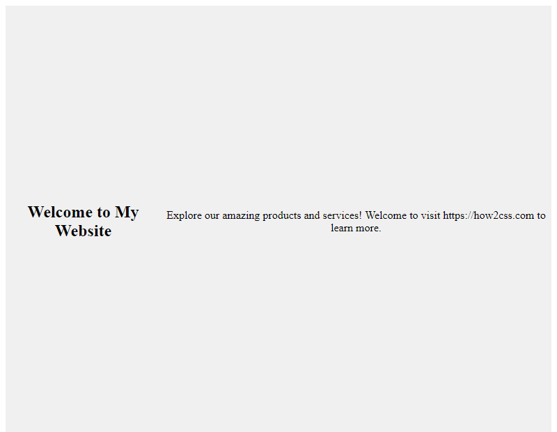
In this example, the .full-height-section class ensures that the section takes up 100% of the viewport height (100vh). Adjust the content and styles within this section as needed.
2. Vertical Centering
vh can also be used to vertically center elements within a container. This technique is valuable for maintaining consistent layout across different screen sizes.
<!DOCTYPE html>
<html lang="en">
<head>
    <meta charset="UTF-8">
    <meta name="viewport" content="width=device-width, initial-scale=1.0">
    <title>Vertical Centering</title>
    <style>
        .container {
            height: 100vh;
            display: flex;
            justify-content: center;
            align-items: center;
            background-color: #f0f0f0;
        }
        .content {
            text-align: center;
        }
    </style>
</head>
<body>
    <div class="container">
        <div class="content">
            <h2>Vertically Centered Content</h2>
            <p>This content is perfectly centered vertically!</p>
        </div>
    </div>
</body>
</html>
A rendering of executing the code:
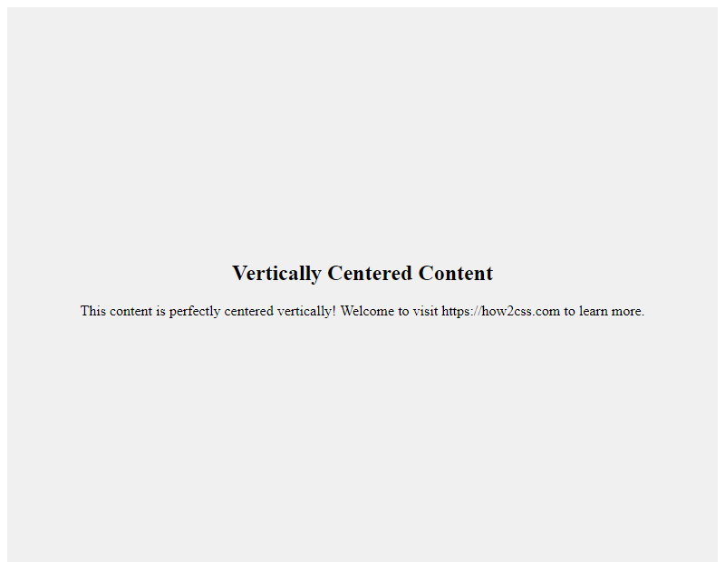
Here, the .container class ensures that its height spans the entire viewport height (100vh), while flexbox is used to vertically and horizontally center the .content within the container.
3. Responsive Typography
Using vh for font sizes can create responsive typography that scales based on the viewport height. This is particularly useful for ensuring text remains readable on smaller devices without compromising design aesthetics.
<!DOCTYPE html>
<html lang="en">
<head>
    <meta charset="UTF-8">
    <meta name="viewport" content="width=device-width, initial-scale=1.0">
    <title>Responsive Typography</title>
    <style>
        body {
            font-family: Arial, sans-serif;
        }
        h1 {
            font-size: 8vh; /* Adjust as needed */
        }
        p {
            font-size: 4vh; /* Adjust as needed */
        }
    </style>
</head>
<body>
    <h1>Responsive Heading</h1>
    <p>This paragraph adjusts its font size based on the viewport height.</p>
</body>
</html>
A rendering of executing the code:

By setting font sizes using vh units, the text will scale proportionally with the viewport height, ensuring optimal readability across various devices.
These techniques demonstrate just a few of the many ways vh can be utilized in CSS to create responsive, scalable designs. Experiment with these techniques and incorporate them into your projects to enhance the user experience across different devices.
Common Problems and Solutions of What is vh in CSS
Understanding the usage of vh in CSS is crucial for developers, but it often comes with its own set of challenges. Let’s explore some common problems developers face when working with vh units and practical solutions to overcome them.
Problem: Unintended Overflow or Scrollbars
One common issue with using vh units arises when elements exceed the viewport height, causing unintended overflow or scrollbars to appear.
Solution:
To prevent overflow or scrollbar issues, ensure that the content within the elements does not exceed the viewport height. You can achieve this by setting a maximum height or using other CSS properties like overflow: hidden.
<!DOCTYPE html>
<html>
<head>
    <title>Preventing Overflow with vh</title>
    <style>
        .container {
            height: 100vh; /* Set container height to viewport height */
            overflow: hidden; /* Hide overflow content */
        }
        .content {
            /* Set content height to 100% of container height */
            height: 100%;
            /* Additional styling */
            background-color: #f0f0f0;
            padding: 20px;
            box-sizing: border-box;
        }
    </style>
</head>
<body>
    <div class="container">
        <div class="content">
            <!-- Your content here -->
        </div>
    </div>
</body>
</html>
A rendering of executing the code:

Problem: Inconsistent Behavior Across Devices
Another challenge developers face is the inconsistent behavior of vh units across different devices and browsers, especially on mobile devices with address bars or toolbars that affect the viewport height.
Solution:
To ensure consistent behavior across devices, consider using CSS frameworks or libraries that handle viewport height adjustments automatically, or use JavaScript to dynamically adjust the styles based on the viewport dimensions.
<!DOCTYPE html>
<html>
<head>
    <title>Handling Inconsistent Behavior with vh</title>
    <style>
        .element {
            height: 100vh; /* Set element height to viewport height */
        }
    </style>
    <script>
        window.addEventListener('resize', () => {
            // Recalculate height on window resize
            document.querySelector('.element').style.height = `${window.innerHeight}px`;
        });
    </script>
</head>
<body>
    <div class="element">
        <!-- Your content here -->
    </div>
</body>
</html>
A rendering of executing the code:

Problem: vh Units Not Suitable for All Use Cases
While vh units are useful for creating full-height sections or elements, they may not always be suitable for every use case, especially when dealing with fixed headers or footers.
Solution:
In scenarios where vh units are not ideal, consider using alternative CSS techniques such as flexbox or grid layout to achieve the desired layout without relying solely on viewport units.
<!DOCTYPE html>
<html>
<head>
    <title>Using Alternative Layout Techniques</title>
    <style>
        .container {
            display: flex; /* Use flexbox layout */
            flex-direction: column; /* Arrange items vertically */
            height: 100vh; /* Set container height to viewport height */
        }
        .header, .footer {
            /* Additional styling for header and footer */
            background-color: #333;
            color: #fff;
            padding: 10px;
        }
        .content {
            /* Fill remaining space */
            flex: 1;
            /* Additional styling */
            background-color: #f0f0f0;
            padding: 20px;
        }
    </style>
</head>
<body>
    <div class="container">
        <div class="header">Header</div>
        <div class="content">
            <!-- Your content here -->
        </div>
        <div class="footer">Footer</div>
    </div>
</body>
</html>
A rendering of executing the code:
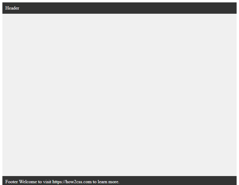
By addressing these common problems and applying the provided solutions, developers can effectively utilize vh units in CSS while minimizing potential issues and ensuring a consistent and optimal user experience across different devices and browsers.
Best Practices of what is vh in CSS
When it comes to utilizing the vh unit in CSS, there are several best practices to consider for effective implementation. Let’s explore these practices in detail:
1. Understanding the vh Unit
The vh unit in CSS stands for viewport height. It represents a percentage of the viewport’s height, where 1vh is equal to 1% of the viewport’s height. This unit is particularly useful for creating elements that scale based on the height of the viewport, ensuring responsiveness across various screen sizes.
2. Ensuring Accessibility and Responsiveness
One of the key advantages of using the vh unit is its ability to create responsive layouts that adapt to different screen sizes. When designing with vh, it’s essential to ensure accessibility by considering how elements will appear on both desktop and mobile devices. Test your layout across various screen sizes to ensure readability and usability.
3. Setting Minimum Heights with vh
One common use case for the vh unit is setting minimum heights for elements, such as sections or containers, to ensure they occupy a certain portion of the viewport regardless of its size. For example, you can set a minimum height of 100vh to ensure a section always occupies the full height of the viewport.
<!DOCTYPE html>
<html lang="en">
<head>
<meta charset="UTF-8">
<meta name="viewport" content="width=device-width, initial-scale=1.0">
<title>Viewport Height Example</title>
<style>
  .section {
    min-height: 100vh;
    background-color: #f0f0f0;
    display: flex;
    justify-content: center;
    align-items: center;
    text-align: center;
  }
  .content {
    padding: 20px;
  }
</style>
</head>
<body>
<section class="section">
  <div class="content">
    <h1>Full Height Section</h1>
    <p>This section will always occupy the full height of the viewport.</p>
  </div>
</section>
</body>
</html>
A rendering of executing the code:
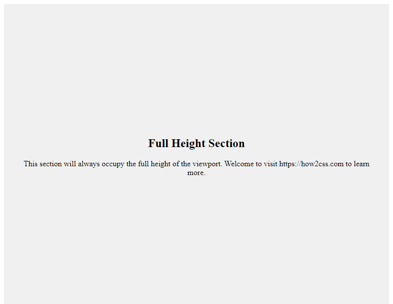
In this example, the .section class sets the minimum height to 100vh, ensuring it always occupies the full height of the viewport. The content is centered both horizontally and vertically within the section.
4. Avoiding vh for Critical Elements
While the vh unit is useful for certain layout aspects, it’s essential to use it judiciously, especially for critical elements such as text content. Using vh for text can lead to readability issues, particularly on smaller screens where the text may become too large or too small. Instead, consider using relative units like em or rem for text sizing to maintain readability across devices.
5. Testing and Iterating
As with any CSS technique, testing and iterating are crucial for ensuring compatibility and effectiveness across different browsers and devices. Use browser developer tools to preview your layout on various screen sizes and make adjustments as needed to achieve the desired result.
By following these best practices, you can harness the power of the vh unit in CSS to create responsive and visually appealing layouts that adapt seamlessly to different viewport sizes.
Conclusion
In conclusion, understanding the vh unit in CSS is essential for creating responsive and scalable web designs. By utilizing vh, developers can ensure consistent sizing relative to the viewport height, enhancing the adaptability of their layouts across various devices. This unit provides a practical solution for building user-friendly interfaces that maintain proportionality and readability regardless of screen size. Incorporating vh into CSS stylesheets empowers developers to design fluid and dynamic web experiences, improving accessibility and user engagement. With a solid grasp of vh, developers can confidently tackle responsive design challenges and deliver seamless browsing experiences to users worldwide.
 How CSS