Css Background
Introduction to CSS Background
In web development, CSS (Cascading Style Sheets) is crucial for styling HTML elements, and the background property plays a fundamental role in defining the background of elements. It allows developers to control various aspects of an element’s background, such as color, image, position, and repetition.
With the background property, developers can set a solid color background using color values like hex, RGB, or predefined color names. They can also specify background images using URLs, enabling the creation of visually appealing designs.
Moreover, CSS provides options for positioning background images, such as background-position, which allows precise placement relative to the element’s box.
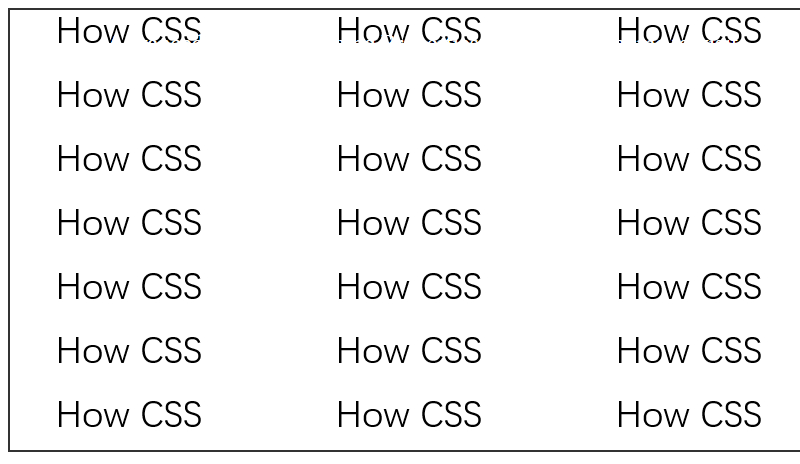
Developers can control how background images are repeated using properties like background-repeat, determining if and how the image tiles across the element’s background.
Additionally, CSS offers properties like background-size, enabling developers to adjust the size of background images, ensuring they fit the element appropriately.
Understanding and mastering the background property in CSS is essential for creating visually engaging web layouts and interfaces. In this article, we’ll delve deep into various aspects of the background property, providing comprehensive analysis, practical advice, and real-world examples to help developers leverage CSS backgrounds effectively in their projects.
<!DOCTYPE html>
<html lang="en">
<head>
    <meta charset="UTF-8">
    <meta name="viewport" content="width=device-width, initial-scale=1.0">
    <title>CSS Background Introduction</title>
    <style>
        .background-example {
            width: 300px;
            height: 200px;
            background-color: #f0f0f0; /* Set background color */
            background-image: url('example.jpg'); /* Set background image */
            background-repeat: no-repeat; /* Do not repeat background image */
            background-position: center; /* Center background image */
            background-size: cover; /* Cover entire background */
        }
    </style>
</head>
<body>
    <div class="background-example"></div>
</body>
</html>
A rendering of executing the code:

This HTML example demonstrates the use of the background property to set both a background color and image for a <div> element. The background image is centered, does not repeat, and covers the entire background area of the element.
Basic CSS Background Properties
The background property in CSS allows developers to control various aspects of an element’s background, including color, image, position, and repetition.
Color:
You can set a solid color background using the background-color property, specifying a color value such as hex, RGB, or color name.
Image:
The background-image property enables you to set a background image using a URL. This could be an image file hosted on the web or a relative path to an image file.
Position:
With the background-position property, you can specify the position of the background image relative to its container. Positions can be defined using keywords (e.g., top, bottom) or pixel values (e.g., 10px 20px).
Repetition:
The background-repeat property determines how the background image should be repeated, with options like repeat, repeat-x, repeat-y, and no-repeat.
Size:
Developers can adjust the size of the background image using the background-size property. This can be specified in pixels, percentages, or using keywords like cover and contain.
Example HTML:
<!DOCTYPE html>
<html>
<head>
    <title>Background Properties Example</title>
    <style>
        .container {
            width: 400px;
            height: 200px;
            background-color: #f0f0f0;
            background-image: url('example.jpg');
            background-position: center;
            background-repeat: no-repeat;
            background-size: cover;
        }
    </style>
</head>
<body>
    <div class="container">
        <!-- Content goes here -->
    </div>
</body>
</html>
A rendering of executing the code:

In this example, the .container element has a gray background color with a background image centered and covering the container. It does not repeat horizontally or vertically.
Advanced CSS Background Properties
Advanced CSS background properties offer developers powerful tools to enhance the visual appeal and functionality of web designs. These properties go beyond basic color and image settings, allowing for fine-tuned control over backgrounds.
One such property is background-attachment, which determines whether a background image scrolls with the rest of the page content or remains fixed in place. This can create effects like parallax scrolling or fixed headers, adding depth and interactivity to the design.
Another essential property is background-clip, which specifies how far the background extends within an element’s box. By default, backgrounds cover the entire content area, but with background-clip, developers can limit backgrounds to specific areas like the padding or border box, enabling creative design choices.
Additionally, background-origin determines the starting point for positioning a background image within an element’s box model. This property is useful for controlling how background images interact with padding and borders, ensuring precise alignment and presentation.
Furthermore, CSS gradients offer a dynamic alternative to static background images. With properties like background-image and background-position, developers can create sophisticated gradient backgrounds that adapt to various screen sizes and orientations, providing a scalable and visually engaging backdrop for web content.
Understanding and leveraging these advanced CSS background properties empower developers to craft immersive user experiences and polished interfaces that captivate and delight visitors.
Here’s a simple HTML example demonstrating the use of advanced CSS background properties:
<!DOCTYPE html>
<html lang="en">
<head>
<meta charset="UTF-8">
<meta name="viewport" content="width=device-width, initial-scale=1.0">
<title>Advanced CSS Background Properties Example</title>
<style>
  .container {
    width: 100%;
    height: 400px;
    padding: 20px;
    border: 2px solid #333;
    background-image: linear-gradient(to right, #ff0000, #00ff00);
    background-attachment: fixed;
    background-clip: padding-box;
    background-origin: border-box;
    color: #fff;
    text-align: center;
    font-size: 24px;
  }
</style>
</head>
<body>
<div class="container">
  Advanced CSS Background Properties Example
</div>
</body>
</html>
A rendering of executing the code:

In this example, we’ve applied several advanced background properties to a container element, including a fixed gradient background that spans the padding box and originates from the border box. This creates a visually striking and responsive layout.
CSS Background Effects
CSS background effects allow developers to create visually stunning and dynamic backgrounds for their webpages. These effects go beyond simple color or image backgrounds, adding depth and interactivity to the user experience.
Common CSS background effects include:
- Gradient Backgrounds: Gradients offer smooth transitions between colors, creating visually appealing backgrounds. They can be linear or radial, and developers can customize the colors and direction to achieve the desired effect.
-
Background Transitions: CSS transitions allow for smooth animations when changing background properties, such as color, image, or position. This adds polish to the user interface and enhances user engagement.
-
Background Blend Modes: Blend modes enable the blending of background layers, creating unique visual effects by combining colors and images in different ways. This can add depth and richness to backgrounds, making them more visually interesting.
-
Background Filters: Filters like blur, grayscale, and brightness can be applied to background images, allowing developers to create artistic effects or enhance readability. These filters can be animated for dynamic effects.
-
Parallax Scrolling: Parallax scrolling involves moving background elements at different speeds as the user scrolls, creating a sense of depth and immersion. This effect adds a dynamic dimension to backgrounds, making them more engaging.
By mastering these CSS background effects, developers can elevate the visual appeal of their websites and create memorable user experiences.
HTML Example:
<!DOCTYPE html>
<html lang="en">
<head>
<meta charset="UTF-8">
<meta name="viewport" content="width=device-width, initial-scale=1.0">
<title>CSS Background Effects Example</title>
<style>
  body {
    margin: 0;
    padding: 0;
    height: 200vh; /* Ensure scrolling for parallax effect */
  }
  .container {
    height: 100vh;
    background: linear-gradient(45deg, #ff00cc, #3333ff);
    background-attachment: fixed;
    background-size: cover;
    background-position: center;
    display: flex;
    justify-content: center;
    align-items: center;
    color: white;
    font-size: 24px;
    text-align: center;
    overflow: hidden;
  }
</style>
</head>
<body>
<div class="container">
  <h1>Welcome to CSS Background Effects</h1>
  <p>Explore the possibilities of CSS background effects to enhance your web designs.</p>
</div>
</body>
</html>
A rendering of executing the code:

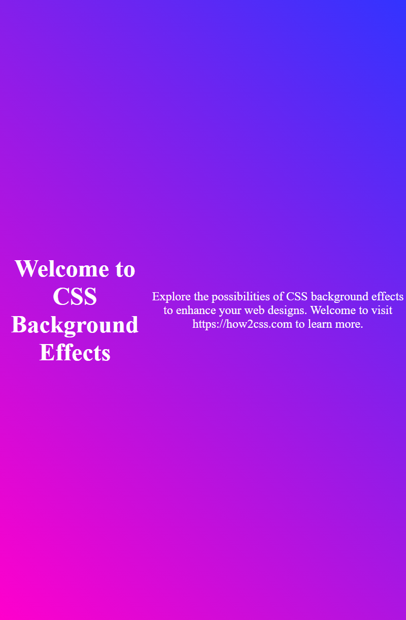
This HTML example demonstrates a simple webpage with a gradient background and parallax scrolling effect, showcasing the use of CSS background effects in practice.
Responsive Background Design
Responsive background design in CSS refers to the practice of creating backgrounds that adapt and scale appropriately based on the dimensions and orientation of the viewport. This ensures that background images or colors maintain their intended appearance across various devices and screen sizes.
To achieve responsive background design, developers typically utilize CSS media queries along with appropriate units for background size and positioning. By setting background properties relative to viewport dimensions or using percentage-based values, backgrounds can adjust dynamically as the viewport changes.
For example, to create a responsive background image that scales proportionally with the viewport width, you can use the background-size property with the value cover:
.background {
    background-image: url('background-image.jpg');
    background-size: cover;
}
This will ensure that the background image covers the entire element’s background area while maintaining its aspect ratio, regardless of the viewport dimensions.
Similarly, for responsive background colors, using percentage-based values for opacity or gradient stops can help ensure consistent appearance across different screen sizes.
In summary, responsive background design involves employing CSS techniques that allow backgrounds to adapt fluidly to various viewport sizes, ensuring a visually pleasing experience for users across different devices and screen resolutions.
<!DOCTYPE html>
<html lang="en">
<head>
<meta charset="UTF-8">
<meta name="viewport" content="width=device-width, initial-scale=1.0">
<title>Responsive Background Design Example</title>
<style>
  .background {
    background-image: url('background-image.jpg');
    background-size: cover;
    height: 100vh; /* Ensure full viewport height */
    width: 100%; /* Ensure full viewport width */
  }
</style>
</head>
<body>
<div class="background">
  <!-- Content goes here -->
</div>
</body>
</html>
A rendering of executing the code:

In this example, the background image will cover the entire viewport, adjusting its size proportionally as the viewport dimensions change.
Accessibility Considerations for CSS Backgrounds
When utilizing CSS backgrounds, it’s crucial to consider accessibility to ensure that all users, including those with disabilities, can perceive and interact with content effectively. Here are some key considerations:
- Color Contrast: Ensure sufficient color contrast between text and background colors to improve readability for users with low vision or color vision deficiencies. Use tools like the WCAG color contrast ratio calculator to verify compliance with accessibility standards.
-
Alternative Text for Images: When using background images for decorative or non-essential purposes, provide alternative text using the
aria-labelattribute or CSScontentproperty. This allows screen readers to convey the image’s content or purpose to visually impaired users. -
Avoid Information Loss: Avoid conveying critical information solely through background images, as they may not be perceivable to users who disable images or have visual impairments. Instead, incorporate essential content into the HTML structure or provide text alternatives.
-
Keyboard Accessibility: Ensure that background elements, such as buttons or links, are keyboard accessible by making them focusable and actionable using the
tabindexattribute or JavaScript event handlers. This ensures that users who rely on keyboard navigation can interact with background elements effectively. -
Screen Reader Compatibility: Test background effects such as gradients, blend modes, and filters to ensure compatibility with screen readers. Some effects may not be conveyed accurately or may interfere with screen reader navigation, affecting the user experience for visually impaired users.
-
Performance Optimization: Optimize background images and effects to minimize page load times, especially for users with slow internet connections or limited bandwidth. Consider using image compression techniques and CSS optimizations to reduce file sizes without compromising quality.
By considering these accessibility guidelines, developers can create CSS backgrounds that enhance user experience for all users, regardless of their abilities or assistive technologies. Prioritizing accessibility not only ensures compliance with standards but also fosters inclusivity and usability in web design.
Performance Optimization for CSS Backgrounds:
Optimizing the performance of CSS backgrounds is crucial for ensuring fast loading times and a smooth user experience. Here are some key strategies:
- Use Efficient Image Formats: Choose the most appropriate image format for your backgrounds. For example, JPEG is suitable for photographs, while PNG is better for images with transparency. Using the correct format can significantly reduce file sizes and improve loading times.
-
Optimize Image Size and Resolution: Resize images to the exact dimensions needed for your backgrounds and optimize their resolution. Avoid using oversized images and consider using image compression techniques to reduce file sizes without sacrificing quality.
-
Minimize HTTP Requests: Combine multiple background images into a single image sprite or use CSS techniques like data URIs to reduce the number of HTTP requests needed to load background images. This reduces latency and speeds up page loading.
-
Cache Background Images: Leverage browser caching by setting appropriate cache-control headers for background images. This allows the browser to store images locally, reducing the need to download them again on subsequent visits to the website.
-
Lazy Loading: Implement lazy loading for background images that are not immediately visible on the initial viewport. Lazy loading defers the loading of off-screen images until they are needed, reducing initial page load times.
-
Optimize CSS Code: Minify and compress your CSS code to reduce file sizes and improve loading times. Remove unnecessary comments, whitespace, and redundant code to streamline the stylesheet.
By implementing these performance optimization techniques, you can ensure that your CSS backgrounds contribute to a fast and efficient web browsing experience for your users.
[Sample HTML Structure]
<!DOCTYPE html>
<html lang="en">
<head>
    <meta charset="UTF-8">
    <meta name="viewport" content="width=device-width, initial-scale=1.0">
    <title>Optimized CSS Backgrounds</title>
    <style>
        /* Your optimized CSS code for backgrounds */
    </style>
</head>
<body>
    <!-- Your optimized HTML content -->
</body>
</html>
A rendering of executing the code:

This HTML structure provides a foundation for implementing optimized CSS backgrounds while ensuring a complete and functional document context.
Cross-Browser Compatibility and CSS Backgrounds
Cross-browser compatibility refers to the ability of a website or web application to function consistently across different web browsers. When it comes to CSS backgrounds, ensuring cross-browser compatibility is crucial for delivering a consistent user experience.
While modern web browsers generally support CSS background properties well, there can still be discrepancies in how certain features are interpreted or rendered. These differences may arise due to variations in browser implementations, vendor prefixes, or evolving web standards.
To ensure cross-browser compatibility with CSS backgrounds:
- Vendor Prefixes: Some CSS features may require vendor prefixes to work correctly in certain browsers. For example, properties like
-webkit-background-clipor-moz-background-sizemay need prefixes for compatibility with older versions of WebKit-based or Mozilla-based browsers. -
Feature Detection: Use feature detection techniques to check if a browser supports specific CSS features before applying them. This allows for graceful degradation or alternative styling for unsupported browsers.
-
Testing: Regularly test your website or web application across different browsers and devices to identify any compatibility issues. Consider using browser testing tools or services to automate this process and ensure comprehensive coverage.
-
Polyfills: In cases where certain CSS features are not supported in older browsers, consider using polyfills or alternative techniques to achieve similar effects. However, be mindful of performance implications and ensure graceful fallbacks for browsers that do not support the polyfill.
By following these best practices, developers can create CSS backgrounds that maintain consistency and functionality across various web browsers, ensuring a seamless user experience for all visitors.
Example HTML Document:
<!DOCTYPE html>
<html lang="en">
<head>
    <meta charset="UTF-8">
    <meta name="viewport" content="width=device-width, initial-scale=1.0">
    <title>CSS Background Example</title>
    <style>
        .container {
            background-color: #f0f0f0;
            padding: 20px;
        }
        .content {
            background-image: url('example.jpg');
            background-size: cover;
            height: 200px;
            color: #fff;
            text-align: center;
            padding-top: 80px;
        }
    </style>
</head>
<body>
    <div class="container">
        <div class="content">
            <h1>Welcome to Our Website</h1>
            <p>This is an example of a CSS background.</p>
        </div>
    </div>
</body>
</html>
A rendering of executing the code:

This HTML document demonstrates a simple webpage with a CSS background applied to a container element. The background image covers the entire element, ensuring consistent display across different browsers.
 How CSS